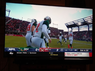
A Tale of Two Tickers
ESPN's XFL presentation last weekend:
Fox's:

ESPN has specialized in putting so much crap on the screen that you can't even see the game. You're watching a program with 80-85% of the available screen space, and ESPN's advertising ticker (that's what it is now) is just screwing things up. Plus the flashing yellow and flashing red for "final scores" and "critical news." It's gotten to the point where it's just trash.
Fox redesigned their scoreboard to fit better on mobile devices, which is very, very smart. The scoreboard is minimal, and it's framed so that additional statistics are shown to the right or left of the scoreboard. A mobile user won't see them.
All in all, it's a huge improvement from FOX (I don't say that much, or ever).

<< Home